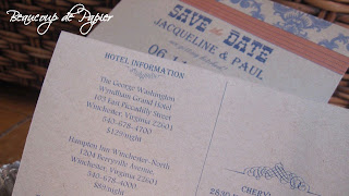
We we actually stayed PRETTY close to the originial design. We played with color and fonts, but kept the basic idea the same. The orange and blue really do pop against the kraft paper!
I love the outcome...and I am sooo super-de-duper excited for this wedding.
 |  |
 |  |


No comments:
Post a Comment